
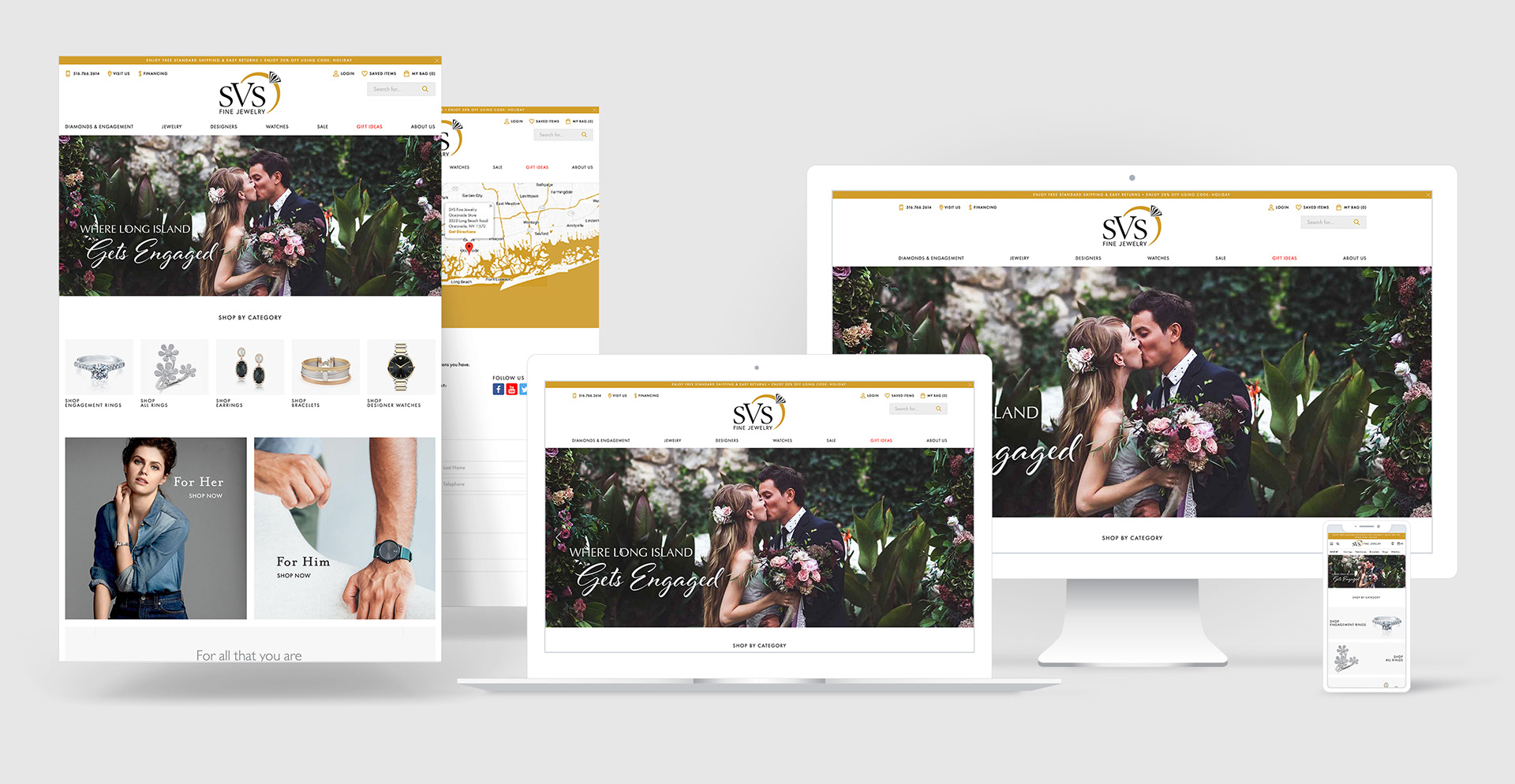
SVS Fine Jewelry Website Redesign & Strategy
The premier jewelry store in Oceanside, NY, SVS had long understood the value of their digital presence, driving shoppers to create wishlists on their website and then visiting their brick & mortar location to shop.
In 2019, they made the push to overhaul their website with Punchmark in favor of a boutique e-commerce experience. The shopping experience was designed to rival those of the "big box" brands in jewelry such as Tiffany, James Allen, and Blue Nile.
With their new website, SVS has increased their online sales 7x since 2018 and become a trailblazer for the rest of the jewelry retail community.
Visit the live website here.
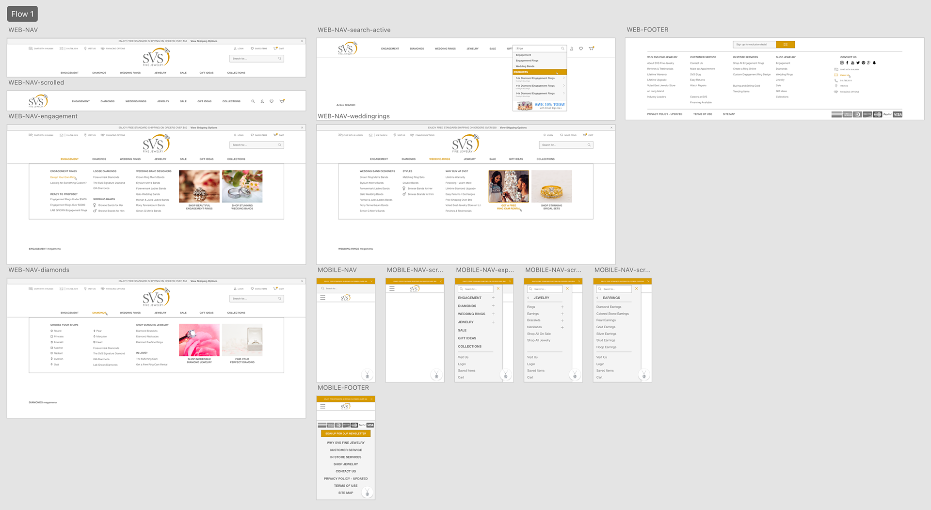
Navigation Design Strategy
I was tasked with creating the navigation and menu designs for the desktop site as well as on mobile.
Special focus was spent on creating intuitive navigation drop-downs that could move the shopper around the website easily without feeling forced or pressured. These "mega menus" included a mix of product landing pages as well as direct links to product grids so that if a shopper was browsing they'd experience more product storytelling than a determined shopper that knew exactly what they wanted.
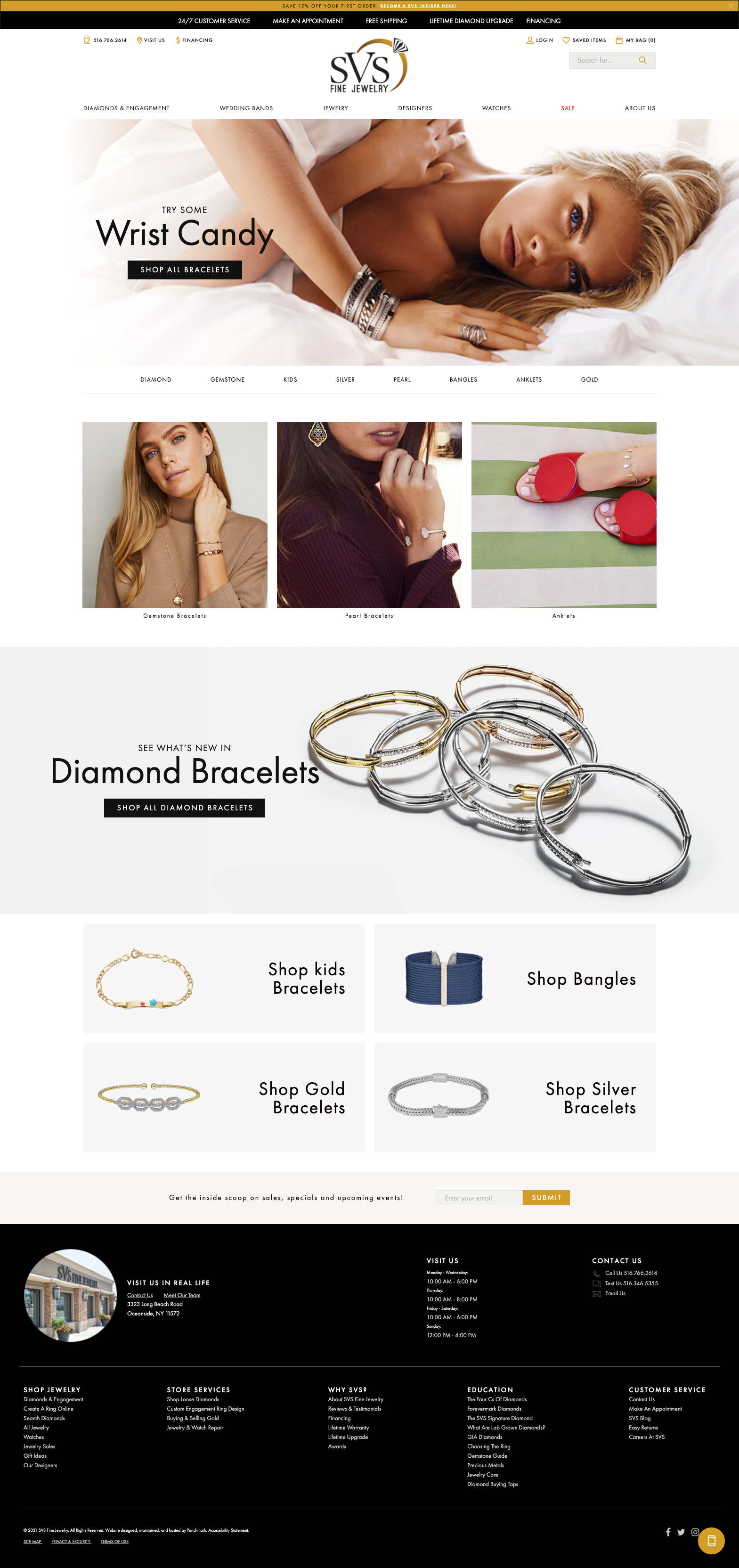
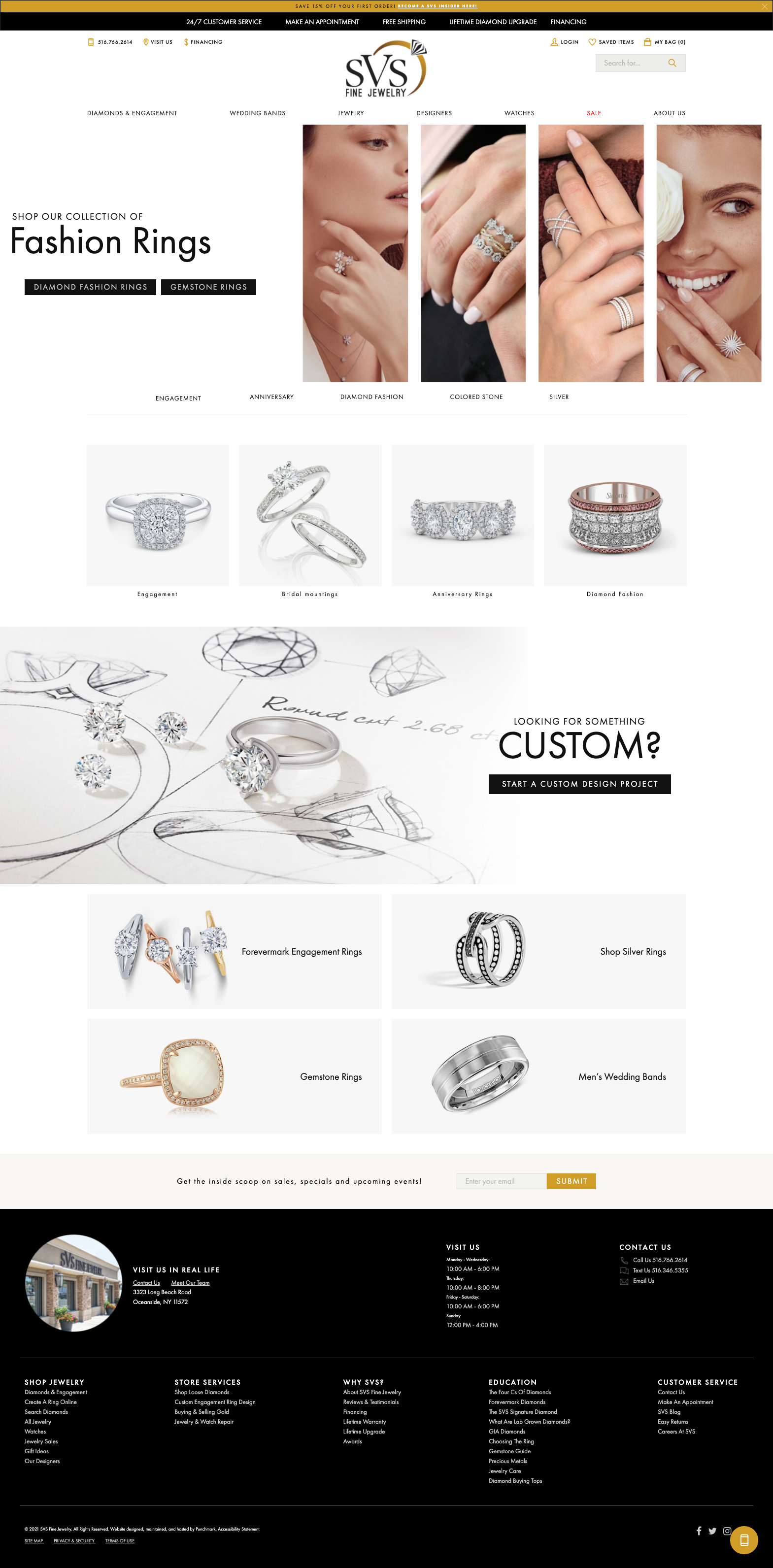
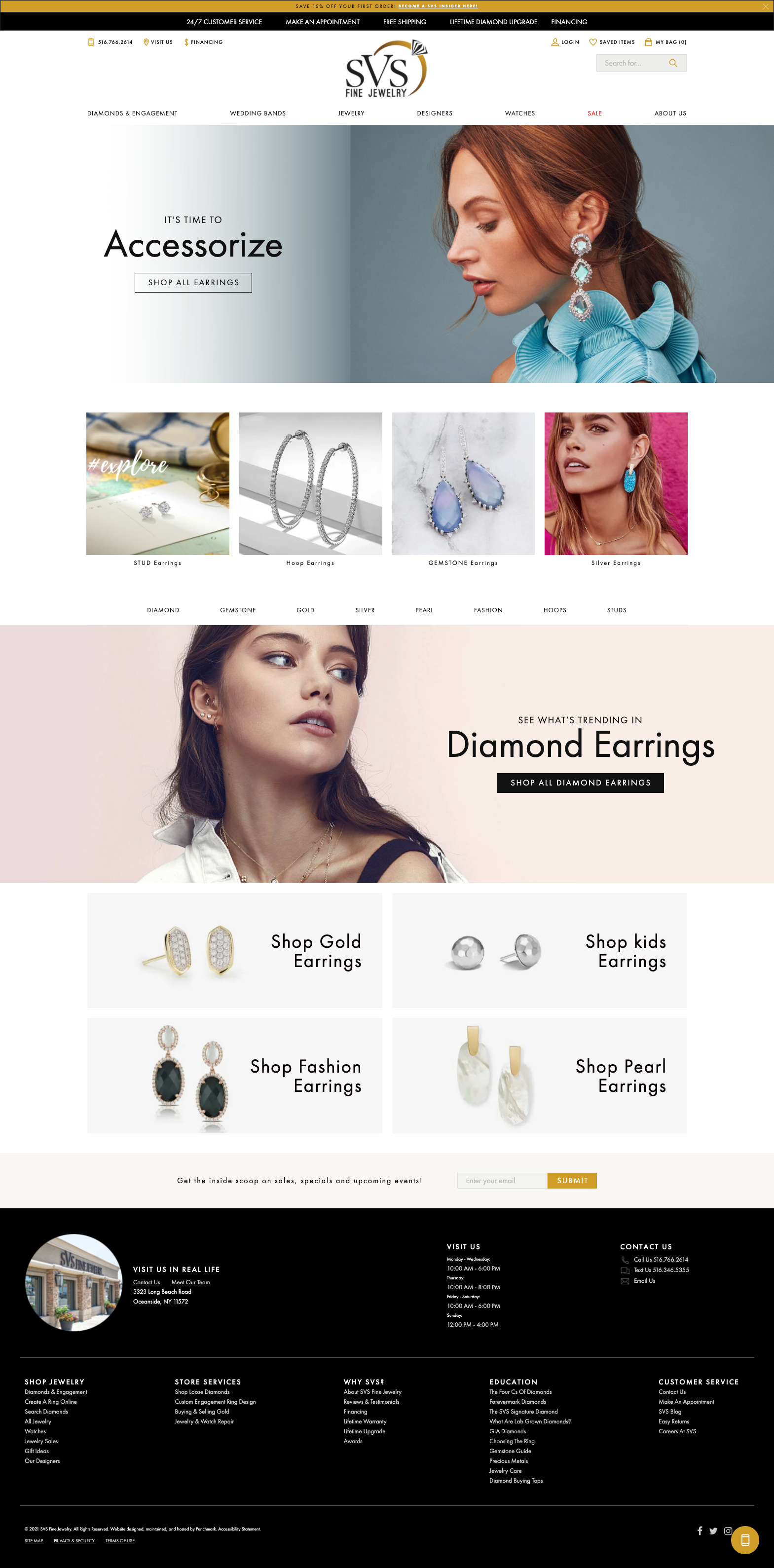
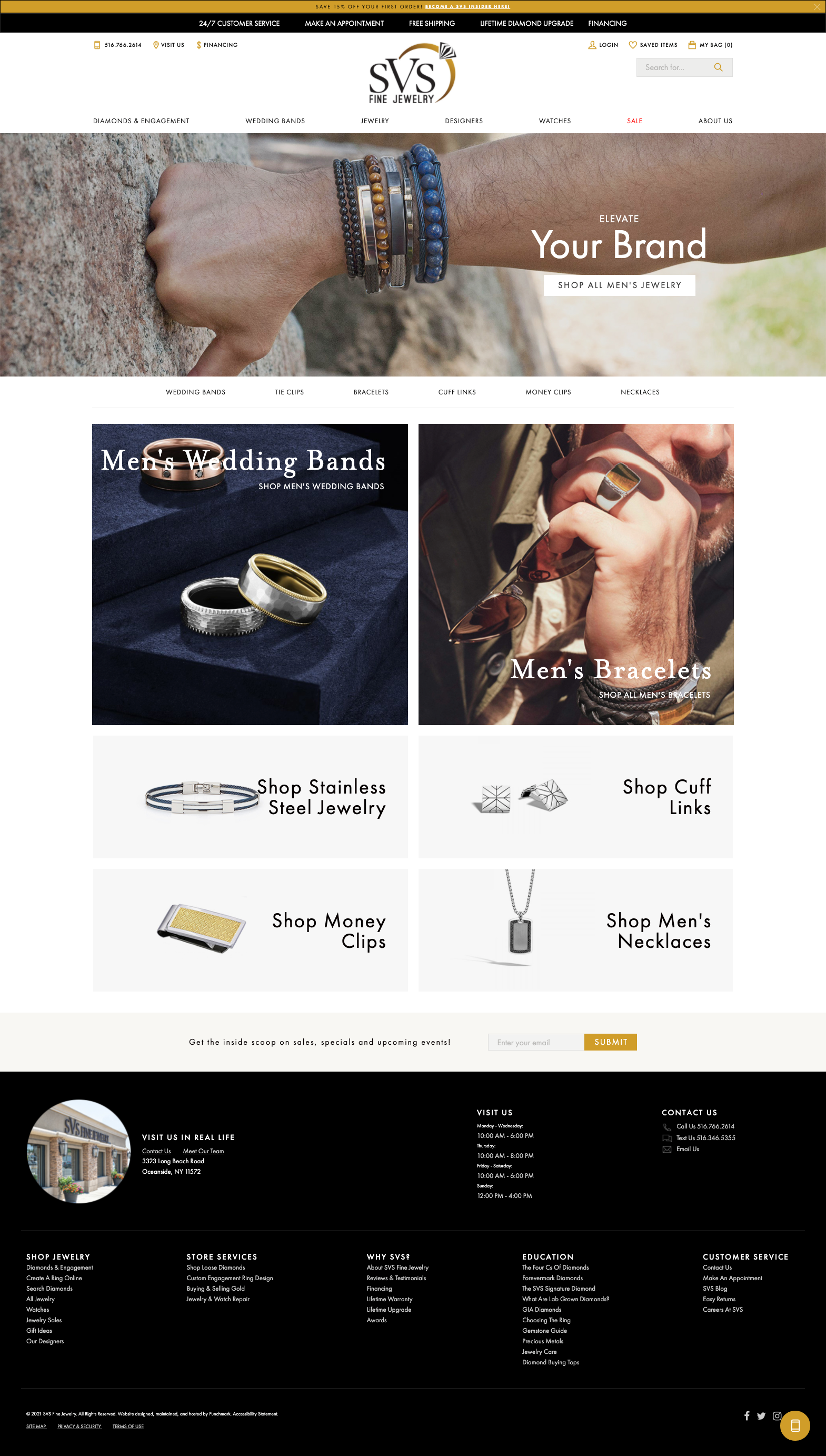
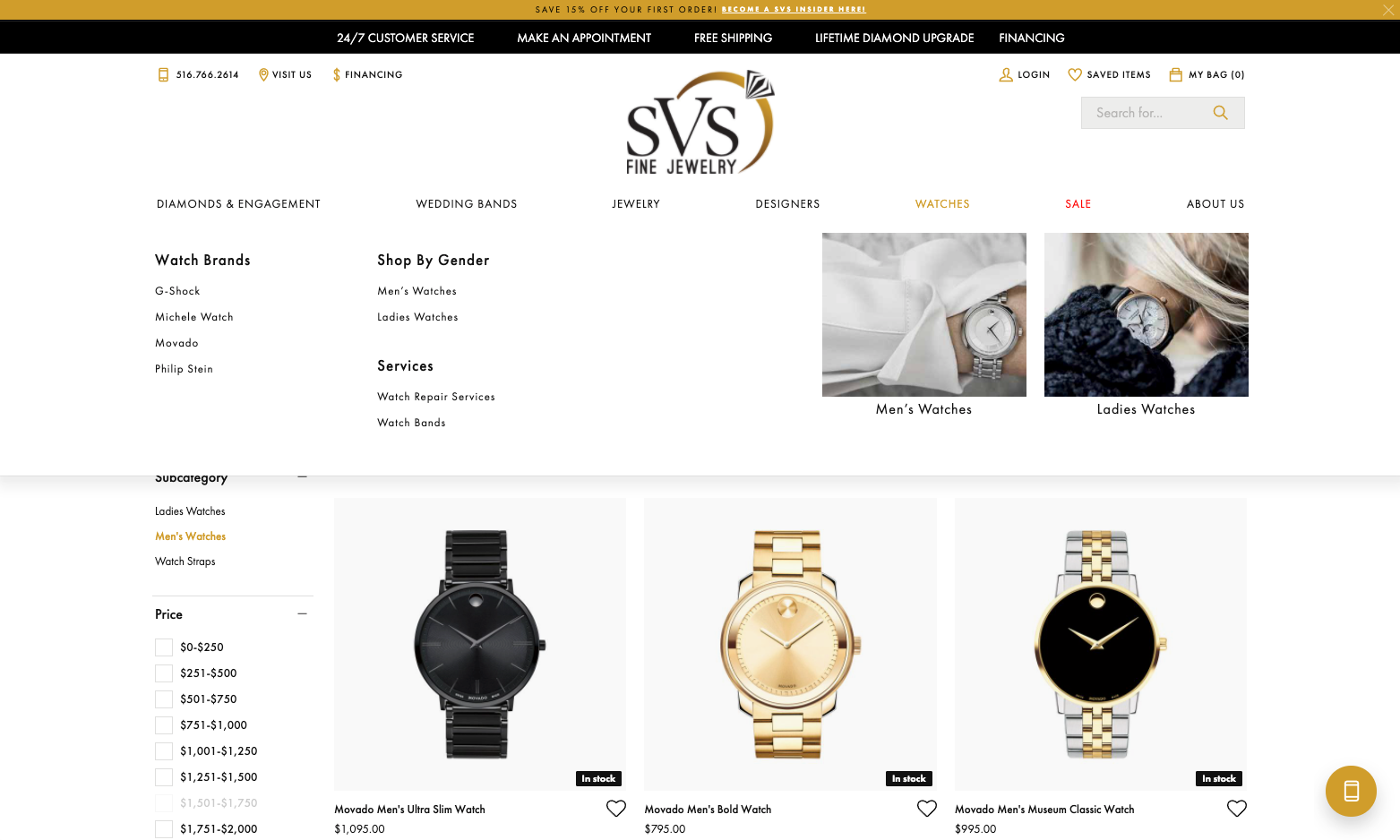
Landing Page Strategy & Design
Pulling in UX strategies and ideas from adjacent industries, we opted to lean heavily on product landing pages that would showcase product subcategories. This allowed for more storytelling and lifestyle imagery to direct the shopper to a subcategory product grid (ex: Hoop Earrings) where they would be served with a more refined selection of products instead of showing them a root category (ex: Earrings) and forcing a shopper to sift through the grid sorting features to find the products they were searching for.
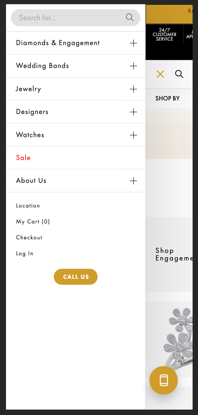
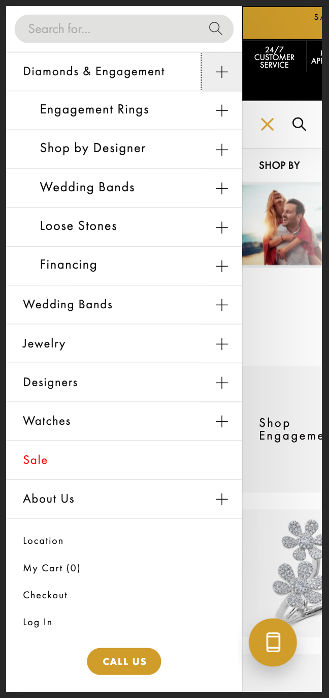
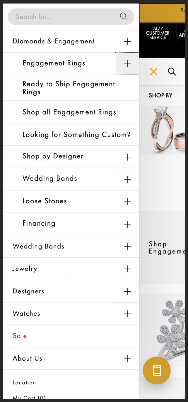
Mobile Navigation
Leaning on the product landing pages that were designed to guide shoppers, we also completely redesigned their mobile hamburger navigation experience.
Analytics indicated that over 60% of page visitors were on a mobile device, which meant that having a seamless mobile experience was paramount to the website's success. We designed a UI that allowed users to flow through the nav drop-downs by selecting the nav item itself for a direct link to the landing page, or by selecting the + signs, they could reveal more dropdown items.
Since rollout, mobile bounce rate has plummeted, and mobile checkouts are up considerably.